At reunion last month, I attended a presentation at the Scripps College Press, where years ago I took the typography class that would shape my life. My class had just five students, all working in a dark, cramped pressroom adjacent to Denison Library. No more. Now
the press has a bright space many times larger, one that fits four proof presses plus all the type and a binding area.
Our class was among the first to produce a limited-edition book in one semester. Teacher Kitty Maryatt's still at it, now with more students and a ready audience including 58 standing patrons for the wide-ranging works that issue. It's hard enough for me to produce a book a year, and these students must come in collaborating from the get-go: within weeks of deciding their subject, they're hard at writing, proofreading, and printing. Naturally, the task of binding arrives at the busiest time of the year. Here's to you, Ms. Maryatt, and all the books you've helped bring into being.
Now for a visual recap of the presentation:
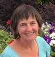
 |
| Kitty Maryatt, director of the Scripps College Press, showcases a limited-edition book produced by the typography class. |
 |
| Ms. Maryatt plumbed the archive for the reunion tour. |
 |
| Arch focuses on women in architecture, and stands on its own. |
 |
| This semester's work in progress. |
 |
| Frederic W. Goudy designed a typeface for the college, underwritten by the Class of 1941. The press puts on an annual lecture in his honor. |
 |
| Books start here, with type set by hand. I still know the California job case by heart. |
 |
| Vandercook envy anyone? |
 |
| Type set on the bed. |
 |
| Typesetters of old-time lead learn to read backwards. |
 |
| All limited edition, all the time. |


1 Comments:
I think I see Boustrophedon there in the last picture—the Chinese-bound gold one on the back pile. That was my semester's book!
Post a Comment
<< Home